
The Brand New Google Store and Design Language
Just take a look at this.
/cdn.vox-cdn.com/uploads/chorus_image/image/69460511/Store_Interior_1.0.jpg) (image from The Verge)
(image from The Verge)
Google’s opened up a physical store for the first time. I’m not going to discuss anything about market strategy, branding, or copying certain other companies. Rather, I just want to talk about this photo.
It’s quite a nice homey store, with natural colors and materials and quirky metal lines around a Google logo for a touch of modernity.
What really draws my attention, however, is how those elements parallel Google’s software and hardware design.
- First off, natural feel and tactility is the whole philosophy of Material Design (not sure about the new Material You, though).
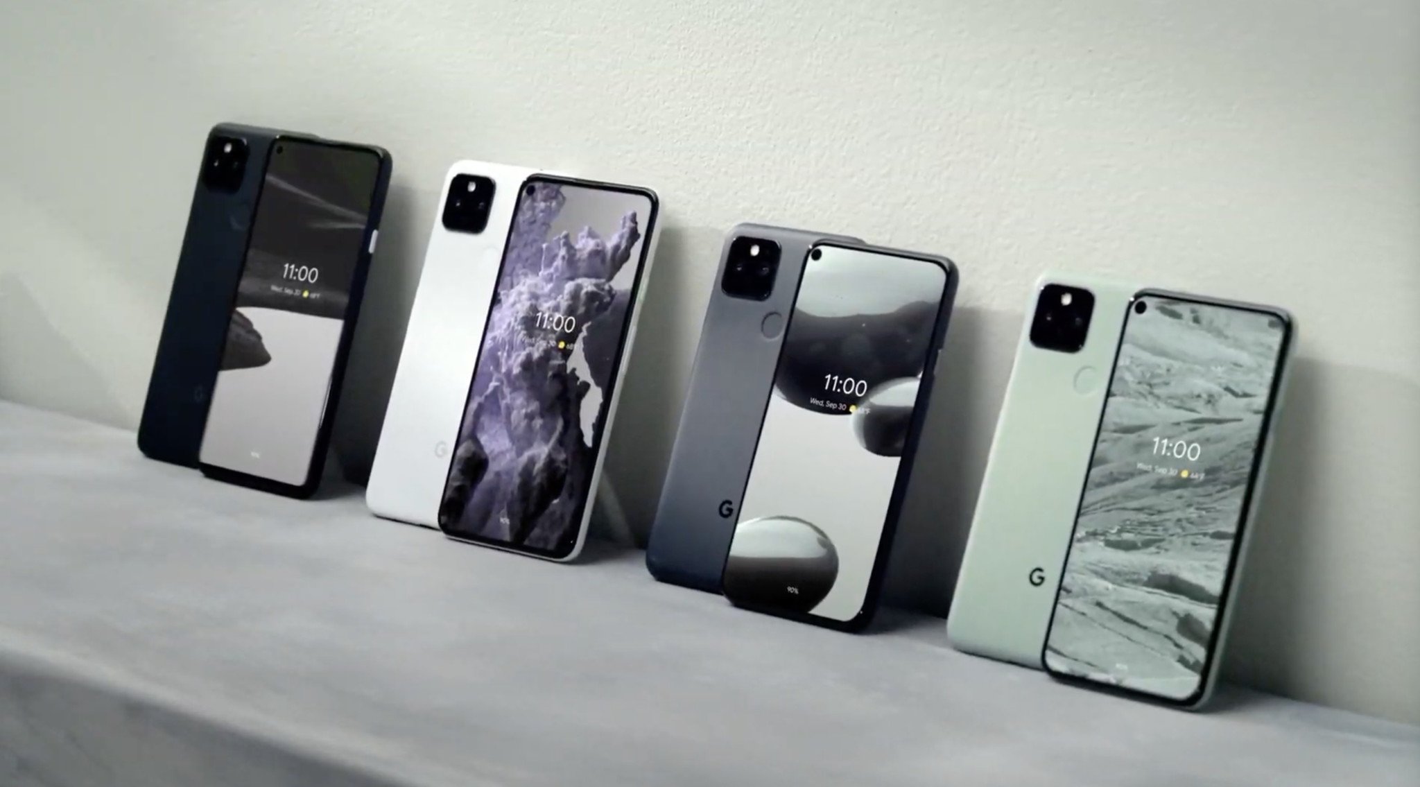
- The natural colors fit right in line with Google’s hardware line, almost as a soft color contrast, which makes sense, since that is what the store sells.
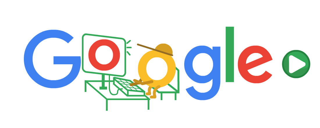
- The wiring is reminiscent of Google’s art style, like this doodle:
This type of brand consistency is something I love. It’s not something you notice right away, but you feel it when you walk into a store or open up a new product.
Written on June 19, 2021